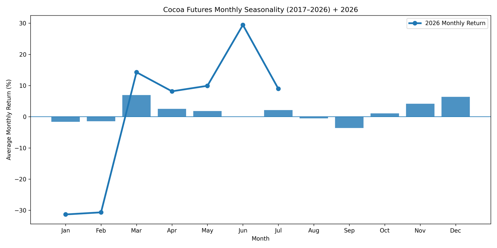
Cocoa Seasonality
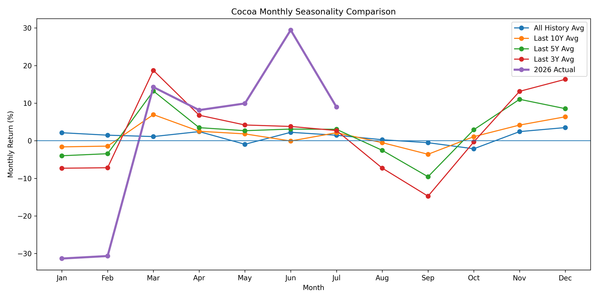
Seasonality Comparison Chart
This chart compares monthly seasonal returns across different time periods (full history, last 10 years, last 5 years, last 3 years) along with the current year’s performance.
It helps identify whether the current market follows long-term trends or more recent patterns.
Monthly Seasonality (Last 3 Years)
This chart represents the most recent seasonal trends in cocoa prices using data from the last three years.
It reflects the latest market conditions and helps identify how the current environment compares to typical seasonal behavior.
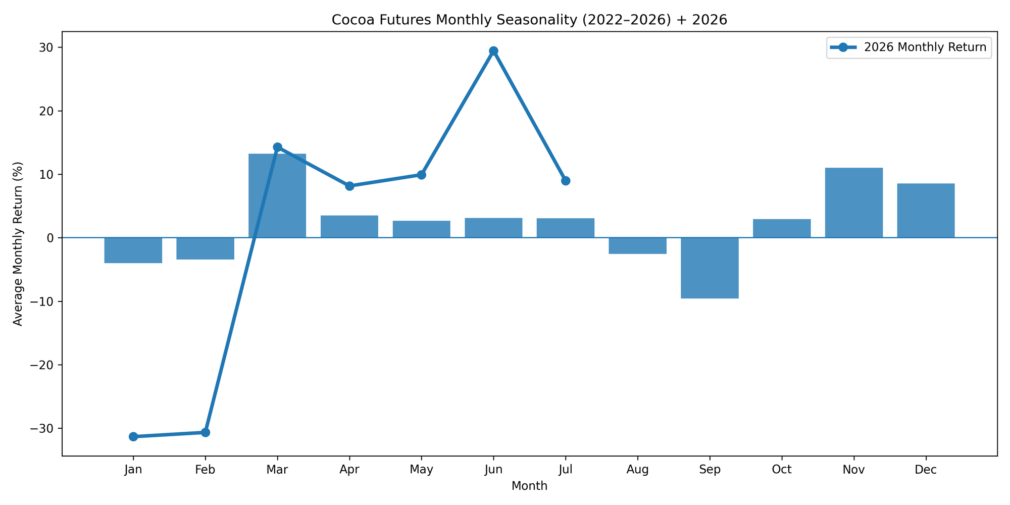
Monthly Seasonality (Last 5 Years)
This chart shows average monthly returns during the past five years.
It highlights short-term seasonal tendencies and recent market dynamics that may differ from long-term historical patterns.
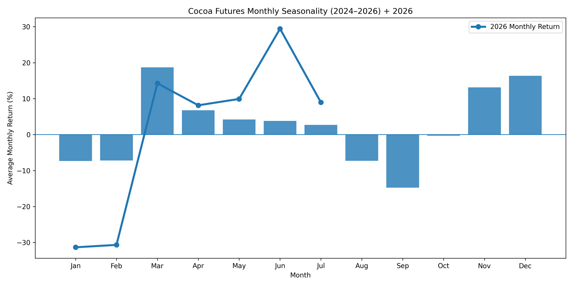
Monthly Seasonality (Last 10 Years)
This chart displays the average monthly cocoa returns over the last 10 years. It focuses on more recent market behavior and highlights how seasonal patterns have developed in the modern cocoa market.
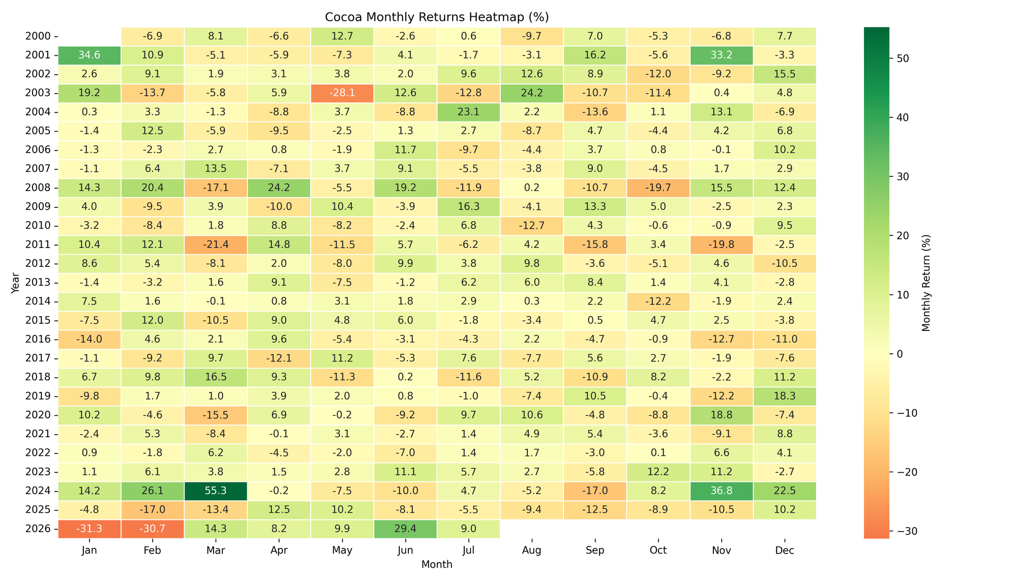
Monthly Returns Heatmap
This heatmap shows monthly cocoa price returns for each year.
Green colors indicate positive returns, while red colors indicate negative returns. The chart allows quick identification of strong or weak months across different years.